Introduction
Presentations are much more than just slides you send or present—they are the key to winning over business partners and helping you secure new clients or investors.
But how do you create presentations that resonate with your audience, drive engagement, and leave a lasting impression?
Compelling presentation design is more than just making slides look good—it is a tool that significantly influences business success. In a world where competition for attention is constantly increasing, standing out through smart presentations is critical. Investing in top-tier presentation design doesn't just pay off in aesthetics; it can revolutionize how companies communicate with clients, colleagues, and investors. In this article, we look at the "10 Best Practices for PowerPoint Design" and show why it's worth investing in the design of persuasive presentations.
Tip 1: Set a clear goal
Before you start designing, be clear about the purpose of your presentation. Do you want to inform, persuade, or inspire? A clearly defined goal helps you adapt the PowerPoint design accordingly and convey your message more effectively.
Adapting to the use case: Consider the purpose and presentation method when designing. If you plan to send the presentation via email, slides can be denser since you won't be there to explain them. In this case, slides must be self-explanatory and contain all necessary information.
Considering oral presentations: If you are presenting in person, ensure slides aren't too crowded; they should only support your speech. Avoid overloading slides with too many details, as this distracts the audience and undermines the effectiveness of your delivery. Ensure slides only contain key information that you can expand upon.
Emphasizing key points: Whether sending via email or presenting live, focus on the key points of your message. Ensure your slides convey these points clearly and concisely to make your message memorable. By tailoring your presentation to the delivery method and focusing on clear goals, you ensure your presentation is effective and successfully communicates your message.
Tip 2: Craft your storyline
Integrate narrative elements into your presentation to build an emotional connection with the audience and make your message stick. A well-told story makes complex concepts understandable and increases engagement.
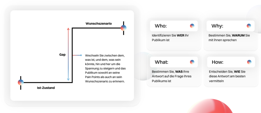
Your audience's current reality isn't what they want it to be—otherwise, they wouldn't be talking to you.
Describe this reality to them. Help them understand why their current state is falling short. Contrast this "current state" with a dream of a better future reality. Vivedly describe "what could be" and compare this future state to the present. Describe the difference between what is and what could be: the "Gap." This gap is their pain point. The larger the gap, the greater the challenge your audience faces.
Use the WWWH (Who – Why – What - How) principle to develop a thoughtful, audience-oriented storyline.
Tip 3: Choose a user-friendly design
Keep your PowerPoint design simple and user-friendly. Use a clear font, sufficient contrast between text and background, and a logical structure to improve readability and ensure your audience can follow along easily.
Choose a clear font: Select a font that is easy to read and communicates your message clearly. Avoid unusual or decorative fonts that can be hard to read. Sans-serif fonts like Arial or Helvetica are often good choices for presentations because they look clean and modern.
Ensure contrast between text and background: Make sure there is enough contrast between your text and the background to improve readability. High contrast, such as black text on a white background or vice versa, makes it easier for the audience to digest text, especially in rooms with varying lighting conditions.
Use a logical structure: Organize your presentation with a clear and logical flow. Use headings, subheadings, and paragraphs to structure content and make navigation easier for your audience. A well-structured presentation allows listeners to understand the connection between different sections and process information better.
Use bullet points and numbering: Bullet points and numbering help break down complex information into manageable sections and direct your audience's attention. Avoid long blocks of text and instead use short, concise sentences and lists to improve readability.
Maintain a consistent design: Keep your design consistent by using uniform formatting for text, graphics, and layouts. This avoids confusion and maintains a professional appearance. For example, use a color palette that runs through the entire presentation and stick to a specific font and size for consistency. By following these user-friendly design principles, you ensure your presentation is easy to understand and follow.
Tip 4: Use visual hierarchy
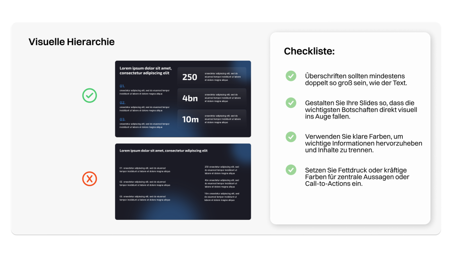
Use size, color, and placement to create a clear visual hierarchy in your presentation design. Important information should be highlighted, while less important elements recede, helping to guide your audience's attention. A clear visual hierarchy is crucial for ensuring your audience grasps the most important information and focuses on what matters. Here is how to achieve an effective visual hierarchy:
Use of size: The size of elements can create a strong visual hierarchy. Present important information in larger font sizes or with larger graphics to make them stand out immediately. Shrinking less important elements helps them fade into the background by comparison.
Coloring for emphasis: Color is another powerful tool for visual hierarchy. Highlight important information with bold, high-contrast colors, while using more subtle tones for less important elements. Use a consistent color palette to keep the design harmonious.
Placement and arrangement: Positioning elements on your slide also helps create hierarchy. Place important information in prominent locations, such as the top half of the slide or the center. Place less important elements at the edges or bottom of the slide to make them less visually present.
Use of contrast: Contrast helps differentiate important information from secondary elements. This can be achieved through contrasting colors, fonts, or background colors. High contrast between key and minor elements directs the audience's attention and improves readability.
Consider reading direction: When placing elements, consider natural reading patterns. In Western cultures, the eye usually moves from left to right and top to bottom. Place important information in areas the eye hits first to ensure it is noticed immediately. By intentionally using size, color, placement, and contrast, you create a clear visual hierarchy and ensure your audience grasps key information quickly and effectively.
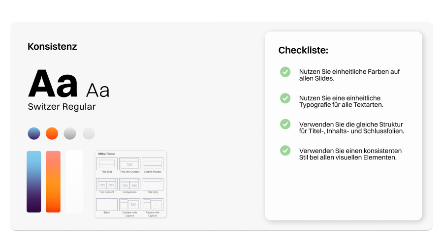
Tip 5: Maintain consistency
Keep your PowerPoint design consistent across all slides. Use a uniform color palette, fonts, and layouts to ensure a professional appearance and make your presentation easier to understand.
Use a uniform color palette: A consistent color palette is key to a professional look. Choose a limited number of complementary colors that fit your topic. Use these colors consistently for text, backgrounds, graphics, and other elements.
Choose consistent fonts: Select one or two legible fonts that match your topic and style. If your company has a corporate font, use it. Apply fonts consistently to headings, body text, subheadings, etc. This improves readability and ensures a professional look.
Maintain a uniform layout: Keep slide layouts consistent for a clear structure and smooth transitions. Ensure elements like titles, text blocks, or logos are always in the same position. This helps your audience focus on content since they know where to look for specific information.
Use consistent graphics and symbols: If you use graphics or icons, ensure they follow the same style and aesthetic. Consistent graphics create a harmonious overall look and help bridge visual connections. For example, ensure all icons have the same line weight and belong to the same style family.
Check consistency regularly: Review consistency frequently, especially if multiple people are involved in creation. Ensure all slides follow the same design guidelines and that no deviations occur. Under time pressure, presentations are often cobbled together from different masters, which hurts professionalism. Our tip: Use PowerPoint's slideshow mode to check for jumping headings, logos, etc.
Pro Tip: Use a grid system: Use a grid system to structure your slides and ensure that text boxes, images, and graphics are consistently aligned. This gives your presentation a professional look and improves readability. Maintaining design consistency ensures a professional appearance and makes your message easier to understand.
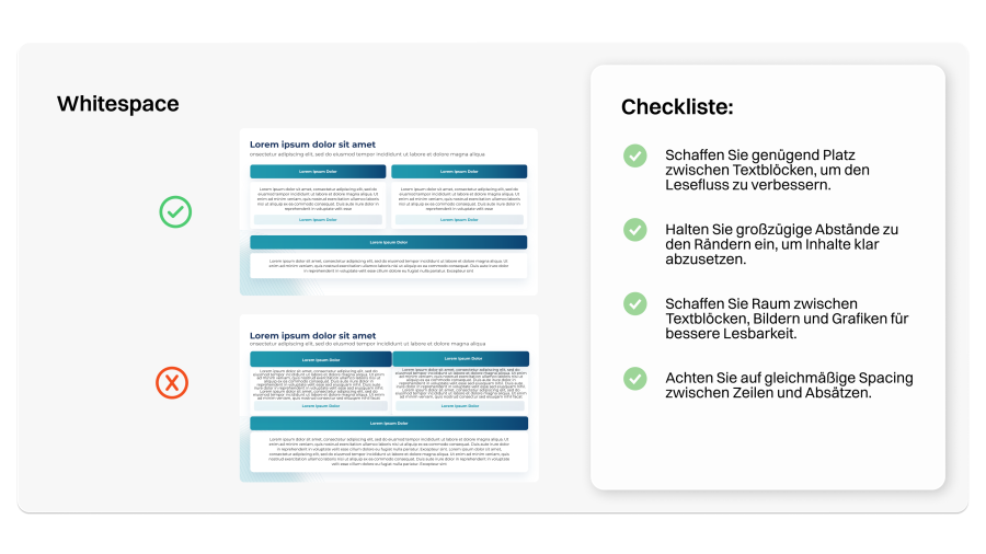
Tip 6: Use negative space effectively
Use negative space effectively to declutter the design and draw attention to important elements. Avoid overloaded slides that overwhelm your audience and create space for a clear, focused presentation.
Defining negative space: Negative space, also known as white space, refers to the area on a slide not occupied by text, graphics, or other elements. This space is as important as the elements themselves and helps improve the design while focusing attention on essential information.
Creating breathing room: Negative space gives your audience's eyes a rest and allows them to focus on core content. By leaving enough space around text and graphics, you create an open, inviting environment that supports understanding and retention.
Emphasizing important elements: Strategically placing negative space around key elements highlights them and emphasizes their importance. By reducing unnecessary or unimportant details, you direct the audience's attention to the essentials and avoid sensory overload.
Improving readability: Proper use of negative space improves readability by creating clear separation between sections, making information easier to process. Avoid grouping text and graphics too tightly to prevent elements from blending together.
Creating visual balance: Negative space helps create visual balance by evening out the design for a harmonious look. Distribute negative space evenly and use it purposefully for an aesthetically pleasing presentation.
Avoiding overload: Don't crowd slides with too many elements; it overwhelms the audience and distracts from your message. Conscious use of negative space ensures your presentation remains clear, focused, and not overwhelming.
By using negative space effectively, you improve your presentation's design, guide your audience's attention, and create a focused delivery that communicates your message effectively.
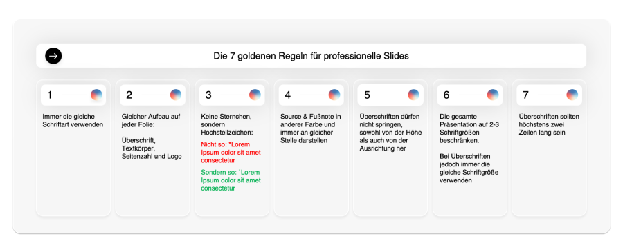
Tip 7: Give your slides formatting and structure
Consistency is key: To ensure a uniform and professional presentation, headings must always be positioned in the same place. This also applies to the logo and all footnotes. This consistency builds a clear structure and improves the overall look.
Fewer bullets, more grids: Avoid overloading slides with too many bullet points. Instead, use grids to present information more clearly. This improves readability and helps the audience grasp content faster. See point 10 for more on this.
Short and concise headings: Headings should ideally be no longer than two lines. This keeps your messages clear and easy to understand. Long headings can look cluttered and distract the audience's focus.
One main message per slide: To guide the reader's or listener's attention to the essentials, each slide should present only one main message. This focus makes it easier for the audience to grasp and retain core information. A clear, focused approach makes your presentation more effective and persuasive.
Here are a few golden rules for professional formatting and structure:
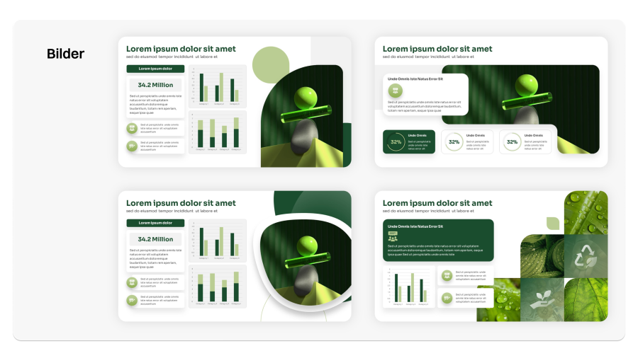
Tip 8: Incorporate images and graphics
Integrate images and graphics to illustrate complex concepts and spark your audience's interest. Use high-quality images that match the topic and support your message for a lasting impact.
Visualizing complex concepts: Images and graphics allow you to represent complex concepts and data visually, making them easier to understand. Instead of presenting abstract information as text, use visual elements to illustrate ideas, helping your audience grasp and remember them better.
Selecting high-quality images: It is crucial to use high-quality images that fit your presentation's topic and support your message. Choose images that are clear, sharp, and professional to make a positive impression. Avoid low-quality images, as they can hurt your presentation's credibility.
Ensure relevance: Ensure selected images and graphics directly contribute to your message and illustrate core themes and key points. Choose visually appealing images that support your message to engage your audience and create a lasting impact.
Uniform style: Choose a consistent style for your images and graphics to create a cohesive look and improve the design. This can include using similar color palettes, editing techniques, or caption styles to ensure all visual elements harmonize.
Integration into presentation flow: Integrate images and graphics seamlessly into the flow to guide your audience's attention and communicate your message effectively. Place relevant images at appropriate points to emphasize key points and support audience understanding.
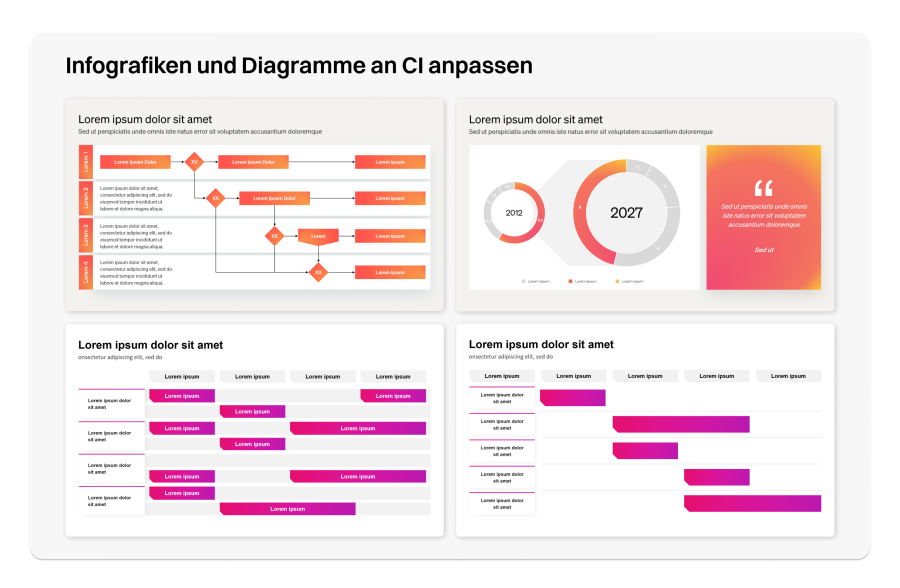
Tip 9: Adapt infographics and charts to your CI
You've likely seen it: your slide is basically done, but you only have screenshots for certain infographics, charts, or diagrams. We recommend rebuilding these screenshots whenever possible to provide your audience or reader with a cohesive appearance. Even if it's tempting to use screenshots for convenience, you should adapt charts and infographics to your CI:
Consistent appearance: Adapting infographics and charts to your company's Corporate Identity (CI) creates a uniform and professional look. This strengthens the brand image and makes your presentations instantly recognizable.
Increased credibility and professionalism: Presentations that consistently reflect the company's CI appear more professional and credible. Adaptations avoid the impression that content was hastily assembled and convey careful, thoughtful communication.
Building brand loyalty: Infographics and charts designed in your CI colors, fonts, and styles support brand recognition and loyalty. This is especially important for presentations to external stakeholders, like clients or investors, to reinforce brand identity.
Better clarity and focus: Uniform design elements don't distract viewers from the content. Deviating colors and styles can confuse, whereas a consistent CI helps convey messages clearly and precisely.
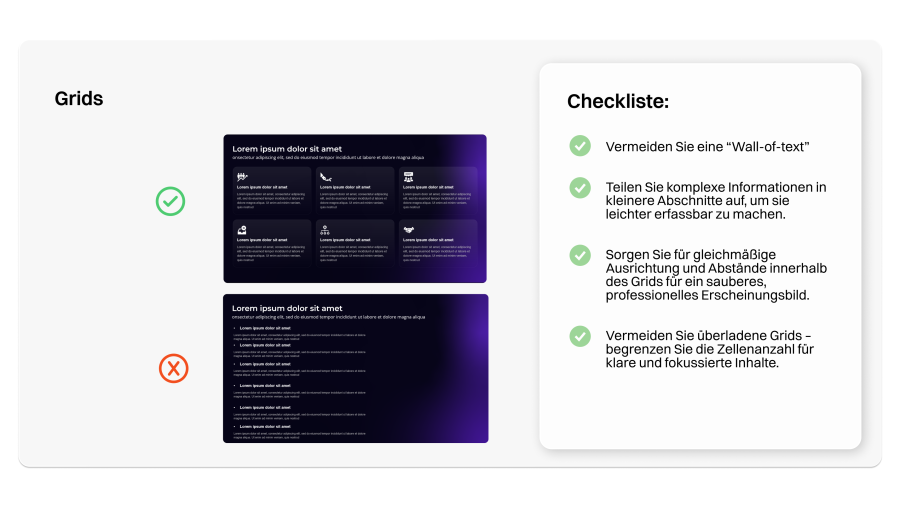
Tip 10: Use grids instead of bullet points
Too many bullets create a "wall of text" and overwhelm the reader or listener. Bullets not only look uninspired but also lead people to skim over things. Instead, divide your content into grids.
Increasing visual appeal: Grids provide a more attractive visual structure compared to long lists of bullet points. They allow for better design by incorporating images, icons, and other visual elements that capture attention and build interest.
Facilitating understanding: A well-designed grid layout breaks complex information into smaller, easier-to-digest sections. This makes it easier for the audience to grasp main points and retain key messages.
Better focus on core messages: Bullet points can tempt you to present too much detail at once. Grids force the presenter to condense information and focus on essential core statements, making the presentation more concise and impactful.
If you have 6 bullets, 2 rows of 3 boxes are ideal, as in this example: