The 5 best expert tips from our designers for your next presentations
Our designers build countless presentations daily for corporate, consulting, and investment banking clients. Here are their top tips for your next deck.
12.06.2023
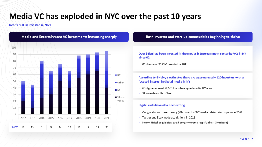
Tip 1: Guide the reader through visual hierarchy
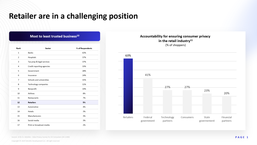
If you focus on a chart without context, the message is hard to spot. That’s common. We use visual hierarchy to prioritize messages. The slide below shows VC media investment by city over time, but the main point isn't clear at first. Is it that total VC investment is growing, that Silicon Valley is outpacing other cities, or something else? The call to interpretation is vague. Context from the title and subtitle makes the focus clear and simplifies things for the audience.
Design the slide so viewers are guided from the high-level idea through various layers down to the details. This ensures the main message is noticed and immediately understood.
Pyramid-principle communication means starting with the main point before moving to details. Look at this slide's design: the eye goes first to the bold title, then to the subtitles in medium font inside blue boxes.
This draws less attention to the subtitles than the title, but more than the rest of the slide. Next, the eye hits the charts, while bullet points—the deepest level of detail—are the least prominent. This intentional navigation through levels makes it easy for the audience to follow your content with minimal effort.
Tip 2: Use meaningful icons
Icons make slides more visually appealing, but their real value lies in their meaning. They provide a thematic cue to the brain without requiring intense thought. This allows the viewer to categorize content at a glance without reading the text.
Without icons or font variations, the same text feels heavy and harder to digest. Visual breaks create clear structure and better understanding. For charts showing data from different countries, flags serve as excellent visual guides.

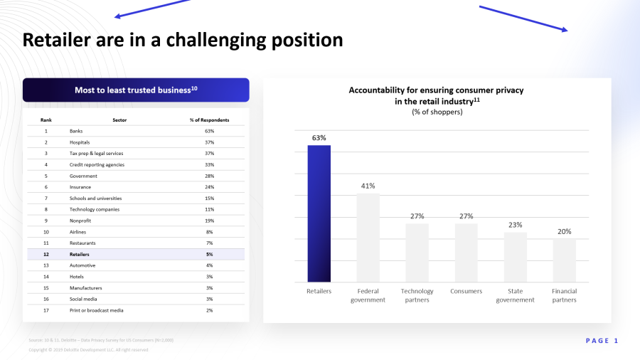
Tip 3: Give your charts a focus
Charts are common in presentations but often used poorly. It’s a mistake to assume a chart’s message is obvious. Unlike you, your audience hasn't seen these slides before and doesn't know where to look. Your job is to make the conclusions obvious and easy to spot.

Use simple tools like arrows, circles, colors, or brief text to direct attention. In the example below, the most important columns were colored blue with a light blue background to make them stand out.
A glance at the chart shows the three most important brands, but highlighting helps the recipient keep their focus in the right place, making information absorption easier.
Tip 4: Highlight the right spots
This example comes from a presentation on electric vehicles. The slide shows a table comparing EV profitability across different markets. It’s a simple slide: a heading and a table with a few rows and columns. However, look at the callout at the bottom: "China offers the most favorable combination of energy prices and driving performance for EV adoption."
A reader might reach this conclusion eventually, but the note provides a shortcut. The corresponding table column is also visually emphasized with a different color. It communicates exactly which data point is relevant for this presentation. The reader grasps the core message faster and easier.

Tip 5: Use CI elements for recognition
If your Corporate Identity includes design elements, use them as recurring stylistic features in your presentations. Look at this slide. Like all others in this deck, it uses a pattern in the top corners that is part of the corporate design. If your logo is highly recognizable, its shape can also serve as a recurring design element.